Brand Identity
Xin Zhong Wen
As a bilingual society, Singaporean students view learning Chinese in a very unique perspective. In 2018, we decided to develop an educational brand that focuses on the unique learning needs of Singaporean children. As such, Xin Zhong Wen represents something new, fresh, and innovative. With this tenet in mind, I developed a brand identity from scratch, focusing on bright, bold colours and clean spaces to invoke positive feelings towards learning Chinese.
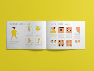
As a young brand that's heavy on graphics, the brand book also came with a detailed illustration style guide on how to draw people and objects. Watch me explain more about the creative direction below:
Role /
Creative Direction
Spatial Design
Booklet Design
Agency /
In House
Year /
2018


